CrunchyCalendar
A beautiful material calendar with endless scroll, range selection and a lot more!
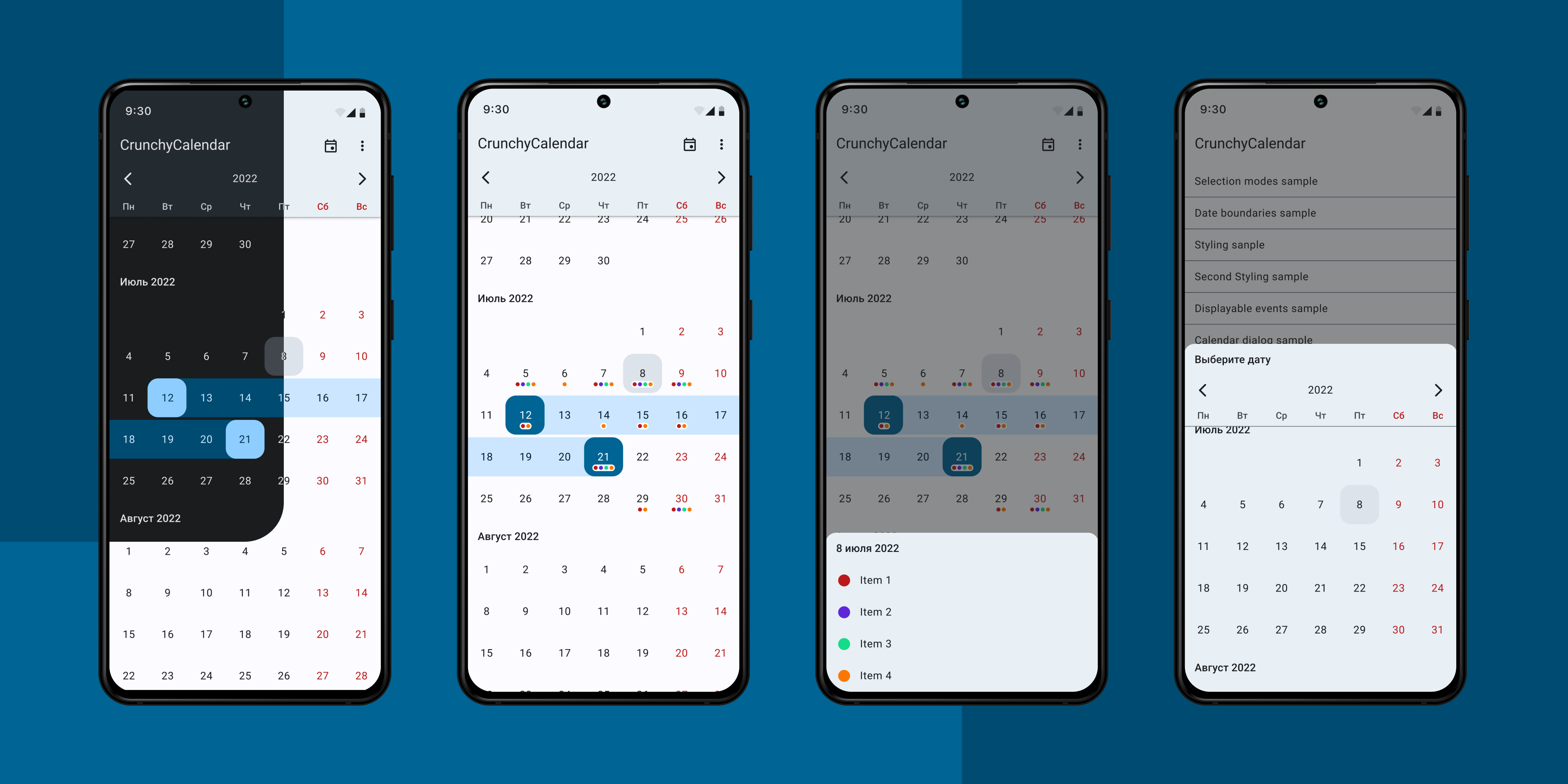
A **light**, **powerful** and **easy to use** Calendar Widget with a number out of the box features: * Infinite vertical scrolling in both directions; * Setting date boundaries to restrict scrolling inside of a specific time period; * Single / multiple / range dates selection; * Pre-selecting dates; * Color customization; * Displaying color indicators; * Setting own custom ItemDecoration; * Presented as a View subclass which can be displayed everywhere: in Activity, Fragment or Dialog, or can be... The project is written primarily in Kotlin, distributed under the MIT License license, first published in 2018. Key topics include: android, calendar, calendar-view, custom-view, java.

CrunchyCalendar
A light, powerful and easy to use Calendar Widget with a number out of the box features:
- Infinite vertical scrolling in both directions;
- Setting date boundaries to restrict scrolling inside of a specific time period;
- Single / multiple / range dates selection;
- Pre-selecting dates;
- Color customization;
- Displaying color indicators;
- Setting own custom ItemDecoration;
- Presented as a View subclass which can be displayed everywhere: in Activity, Fragment or Dialog,
or can be integrated into another custom View.
Dependency
This library is available on Maven Central (Previously on jCenter).
Gradle
implementation 'ru.cleverpumpkin:crunchycalendar:2.6.1'
Maven
xml<dependency> <groupId>ru.cleverpumpkin</groupId> <artifactId>crunchycalendar</artifactId> <version>2.6.1</version> <type>pom</type> </dependency>
Usage
Here's a basic example of Calendar usage.
First of all, you should declare CalendarView in your layout XML file.
xml<ru.cleverpumpkin.calendar.CalendarView android:id="@+id/calendar_view" android:layout_width="match_parent" android:layout_height="match_parent" />
Perform Calendar setup in your Activity or Fragment class.
kotlinval calendarView = view.findViewById(R.id.calendar_view) val calendar = Calendar.getInstance() // Initial date calendar.set(2018, Calendar.JUNE, 1) val initialDate = CalendarDate(calendar.time) // Minimum available date calendar.set(2018, Calendar.MAY, 15) val minDate = CalendarDate(calendar.time) // Maximum available date calendar.set(2018, Calendar.JULY, 15) val maxDate = CalendarDate(calendar.time) // List of preselected dates that will be initially selected val preselectedDates: List<CalendarDate> = getPreselectedDates() // The first day of week val firstDayOfWeek = java.util.Calendar.MONDAY // Set up calendar with all available parameters calendarView.setupCalendar( initialDate = initialDate, minDate = minDate, maxDate = maxDate, selectionMode = SelectionMode.NONE, selectedDates = preselectedDates, firstDayOfWeek = firstDayOfWeek, showYearSelectionView = true )
Note: all parameters in setupCalendar() method are optional and have default values.
To handle date click / long click with custom action, you can do this:
kotlin// Set date click callback calendarView.onDateClickListener = { date -> // Do something ... // for example get list of selected dates val selectedDates = calendarView.selectedDates } // Set date long click callback calendarView.onDateLongClickListener = { date -> // Do something ... }
Saving and Restoring state
Calendar takes care of saving and restoring its internal state (selected dates, selection mode, etc.),
so there's no need to save it manually and call CalendarView.setupCalendar() method every time,
when Activity or Fragment is recreated.
If a Calendar was set up with CalendarView.setupCalendar() method before restoring state, previous saved
state will be ignored.
Dates Selection
Calendar supports several selection modes: single, multiple and range.
Note: You can restrict selection of some dates by implementing your own filtration logic:
kotlin// Here we make weekends unavailable for selection calendarView.dateSelectionFilter = { date -> date.dayOfWeek != Calendar.SATURDAY && date.dayOfWeek != Calendar.SUNDAY }
Single date selection
Only one date can be selected at a time.
kotlin// Set up calendar with SelectionMode.SINGLE calendarView.setupCalendar(selectionMode = SelectionMode.SINGLE) ... // Get selected date or null val selectedDate: CalendarDate? = calendarView.selectedDate // Get list with single selected date or empty list val selectedDates: List<CalendarDate> = calendarView.selectedDates
Multiple dates selection
A number of dates can be selected. Pressing an already selected date will unselect it.
kotlin// Set up calendar with SelectionMode.MULTIPLE calendarView.setupCalendar(selectionMode = SelectionMode.MULTIPLE) ... // Get all selected dates in order they were added or empty list val selectedDates: List<CalendarDate> = calendarView.selectedDates
Range date selection
Allows you to select a date range. Previous selected range is cleared when you select another one.
kotlin// Set up calendar with SelectionMode.RANGE calendarView.setupCalendar(selectionMode = SelectionMode.RANGE) ... // Get all selected dates in range (includes start and end date) or empty list val selectedDates: List<CalendarDate> = calendarView.selectedDates
Color Indicators
The Calendar is able to display simple color indicators (dots) on the date cell.
Color indicator represents as simple interface, which you can implement in your classes.
kotlininterface DateIndicator { val date: CalendarDate // indicator date val color: Int // indicator color }
Here's an example of setting indicators to display on the Calendar.
kotlin// Set up calendar calendarView.setupCalendar() val indicators: List<DateIndicator> = getDatesIndicators() // Set List of indicators that will be displayed on the calendar calendarView.datesIndicators = indicators
To get all indicators for specific date, you can do this:
kotlin// Set date click callback calendarView.onDateClickListener = { date -> // Get all indicators for the date val indicatorsForDate = calendarView.getDateIndicators(date) // do something ... }
Additional text on date cell
The Calendar is able to display additional text on the date cell.
Additional text represents as simple interface, which you can implement in your classes.
kotlininterface AdditionalText { val date: CalendarDate // text's date val text: String // text to display val color: Int // text's color }
Here's an example of setting additional text to display on the Calendar.
kotlin// Set up calendar calendarView.setupCalendar() val additionalTexts: List<AdditionalText> = generateAdditionalTexts() // Set List of additional texts that will be displayed on the calendar calendarView.datesAdditionalTexts = additionalTexts
Using default or root locale on digits
The Calendar is able to display digits using default or root locale.
kotlin// Set true for root locale or false for default locale. If nothing is set default locale will be used. setUseRootLocale(true) // Then set up calendar calendarView.setupCalendar()
View Customization
Calendar appearance open for customization.
Styling using XML
Calendar appearance can be customized with XML attributes. Here's an example of applying custom style to change Calendar appearance.
Define your custom style for the Calendar.
xml<style name="CalendarViewCustomStyle"> <item name="android:background">@android:color/white</item> <item name="calendar_date_background">@drawable/custom_date_bg_selector</item> <item name="calendar_date_text_color">@color/custom_date_text_selector</item> <item name="calendar_day_bar_background">@color/custom_calendar_days_bar_background</item> <item name="calendar_day_bar_text_color">@color/custom_calendar_days_bar_text_color</item> <item name="calendar_day_bar_weekend_text_color">@color/custom_calendar_days_bar_text_color</item> <item name="calendar_grid_color">@color/custom_calendar_grid_color</item> <item name="calendar_grid_on_selected_dates">false</item> <item name="calendar_month_text_color">@color/custom_calendar_month_text_color</item> <item name="calendar_year_selection_arrows_color"> @color/custom_calendar_year_selection_arrows_color </item> <item name="calendar_year_selection_background"> @color/custom_calendar_year_selection_background </item> <item name="calendar_year_selection_text_color"> @color/custom_calendar_year_selection_text_color </item> </style>
Apply your custom style.
xml<ru.cleverpumpkin.calendar.CalendarView android:id="@+id/calendar_view" style="@style/CalendarViewCustomStyle" android:layout_width="match_parent" android:layout_height="match_parent" />
To define custom styles for all Calendars in your app at once you can do this:
xml<style name="AppTheme" parent="Theme.AppCompat.Light.NoActionBar"> <!-- ...snip... --> <item name="calendarViewStyle">@style/CalendarViewCustomStyle</item> <!-- ...etc... --> </style>
Styling using code
You can also set styles and colors programmatically:
kotlinwith(calendarView) { setDrawGridOnSelectedDates(drawGrid = true) setGridColorRes(R.color.custom_calendar_grid_color) setYearSelectionBarBackgroundColorRes(R.color.custom_calendar_year_selection_background) setYearSelectionBarArrowsColorRes(R.color.custom_calendar_year_selection_arrows_color) setYearSelectionBarTextColorRes(R.color.custom_calendar_year_selection_text_color) setDaysBarBackgroundColorRes(R.color.custom_calendar_days_bar_background) setDaysBarTextColorRes(R.color.custom_calendar_days_bar_text_color) setDaysBarWeekendTextColorRes(R.color.custom_calendar_days_bar_text_color) setMonthTextColorRes(R.color.custom_calendar_month_text_color) setDateCellBackgroundRes(R.drawable.custom_date_bg_selector) setDateCellTextColorRes(R.color.custom_date_text_selector) }
If you need to add some custom drawing logic for Calendar, you can implement standard
RecyclerView.ItemDecoration and add it for Calendar using addCustomItemDecoration() method.
kotlin// Set up calendar calendarView.setupCalendar() // Some custom decoration logic val customItemDecoration = CustomItemDecoration() // Add custom item decoration for calendar calendarView.addCustomItemDecoration(customItemDecoration)
There is an abstract helper class AbsDateItemDecoration that you can extend to implement custom
drawing logic for specific dates cells.
Sample app
The Sample app is available for download from Google Play.
Sketch file
Wouldn’t it be a real pain for your designer to ignore Calendar View in your apps mockups? Or for them to try and explain to you, which colors you should use by adding them to Jira task in plain text?
That is lame. That’s why we’ve added a .sketch-file to this repository here. Have fun!
License
MIT License

Copyright (c) 2018 CleverPumpkin Ltd.

Permission is hereby granted, free of charge, to any person obtaining a copy
of this software and associated documentation files (the "Software"), to deal
in the Software without restriction, including without limitation the rights
to use, copy, modify, merge, publish, distribute, sublicense, and/or sell
copies of the Software, and to permit persons to whom the Software is
furnished to do so, subject to the following conditions:

The above copyright notice and this permission notice shall be included in all
copies or substantial portions of the Software.

THE SOFTWARE IS PROVIDED "AS IS", WITHOUT WARRANTY OF ANY KIND, EXPRESS OR
IMPLIED, INCLUDING BUT NOT LIMITED TO THE WARRANTIES OF MERCHANTABILITY,
FITNESS FOR A PARTICULAR PURPOSE AND NONINFRINGEMENT. IN NO EVENT SHALL THE
AUTHORS OR COPYRIGHT HOLDERS BE LIABLE FOR ANY CLAIM, DAMAGES OR OTHER
LIABILITY, WHETHER IN AN ACTION OF CONTRACT, TORT OR OTHERWISE, ARISING FROM,
OUT OF OR IN CONNECTION WITH THE SOFTWARE OR THE USE OR OTHER DEALINGS IN THE
SOFTWARE.
Maintainers

CrunchyCalendar is maintained and developed by CleverPumpkin.
Contributors
Showing top 5 contributors by commit count.


Related Repositories

flutter/flutter
Flutter makes it easy and fast to build beautiful apps for mobile and beyond

Genymobile/scrcpy
Display and control your Android device

react/react-native
A framework for building native applications using React

justjavac/free-programming-books-zh_CN
:books: 免费的计算机编程类中文书籍,欢迎投稿

rustdesk/rustdesk
An open-source remote desktop application designed for self-hosting, as an alternative to TeamViewer.

Hack-with-Github/Awesome-Hacking
A collection of various awesome lists for hackers, pentesters and security researchers