Jetpack Compose UI Components Material 3
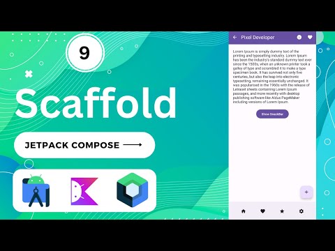
Material Components Jetpack Compose offers an implementation of Material Design, a comprehensive design system for creating digital interfaces. Material Components such as buttons, cards, and switches, and layouts like Scaffold are available as composable functions.
Jetpack Compose is a modern Android UI toolkit that simplifies UI development on the Android platform. Here is a list of some commonly used Jetpack Compose UI components as of my last knowledge update in September 2021. Please note that Jetpack Compose evolves rapidly, and there may have been additions or changes since then. The project is written primarily in Kotlin, first published in 2023. Key topics include: jetpack, jetpack-android, jetpack-compose, jetpack-compose-android, jetpack-compose-example.
Jetpack-Compose-UI-Components-Material-3
<img src="https://github.com/Dinesh2510/Jetpack-Compose-UI-Components-Material-3/blob/main/PDF%20Book.png?raw=true" width="750">Jetpack Compose is a modern Android UI toolkit that simplifies UI development on the Android platform. Here is a list of some commonly used Jetpack Compose UI components as of my last knowledge update in September 2021. Please note that Jetpack Compose evolves rapidly, and there may have been additions or changes since then.
-
Text:
Textcomposable is used to display text on the screen. It supports various text styling options. -
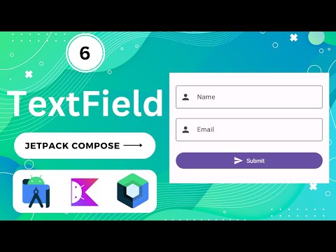
TextField:
TextFieldallows users to input text. It's often used for forms and user input. -
Button:
Buttoncomposable creates interactive buttons with customizable text and click behavior. -
Image:
Imagecomposable displays images in your app. It supports various image sources and content modes. -
Column:
Columnis a composable that arranges its children vertically, one after another. -
Row:
Rowis a composable that arranges its children horizontally, side by side. -
Box:
Boxis a versatile composable for creating complex layouts and applying transformations. -
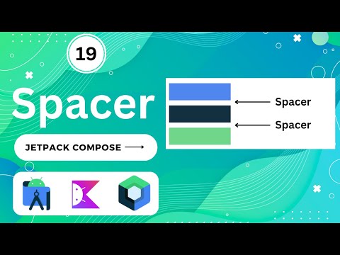
Spacer:
Spaceris a simple composable used for adding space between other composables. -
Surface:
Surfaceis used for theming and applying background colors to composables. -
Card:
Cardis a material design component used for displaying content in a contained, elevated box. -
AlertDialog:
AlertDialogdisplays a modal dialog with a title, message, and customizable buttons. -
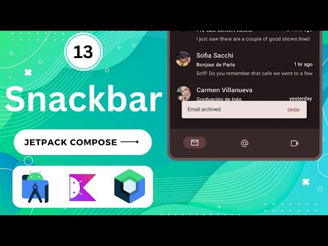
Snackbar:
Snackbardisplays a brief message at the bottom of the screen. -
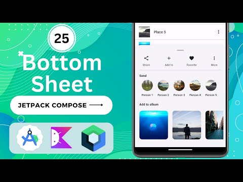
BottomSheet:
BottomSheetcreates a modal bottom sheet that slides up from the bottom of the screen. -
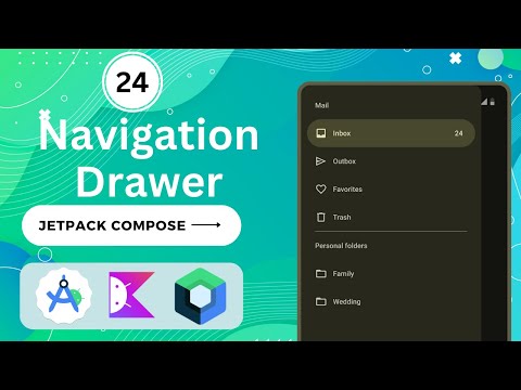
Drawer:
Draweris used to create a navigation drawer that slides in from the edge of the screen. -
TopAppBar:
TopAppBaris a top app bar for navigation and actions. -
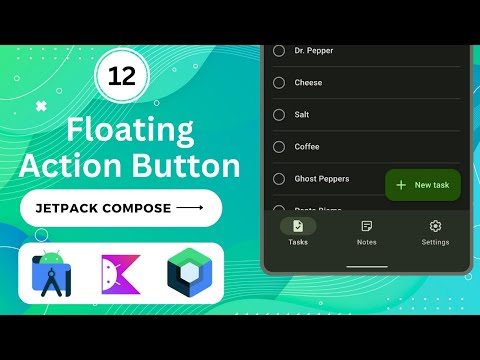
FloatingActionButton:
FloatingActionButtoncreates a button for primary actions. -
Navigation: Jetpack Compose includes a navigation component for managing navigation between composables.
-
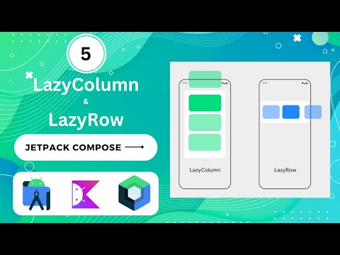
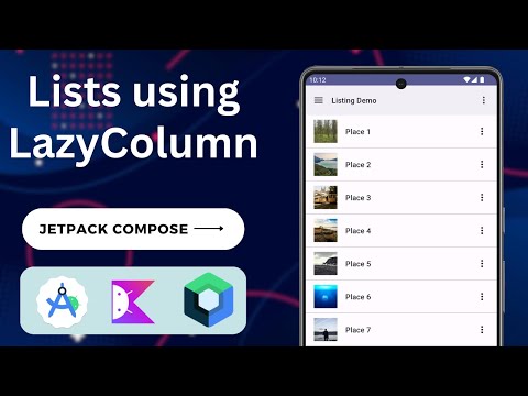
LazyColumn:
LazyColumnis a vertically scrolling list that loads items on-demand, suitable for long lists. -
LazyRow:
LazyRowis a horizontally scrolling list that loads items on-demand. -
TabRow:
TabRowis used for creating tabs in your app. -
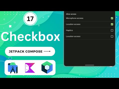
CheckBox:
CheckBoxcreates a checkbox for selecting options. -
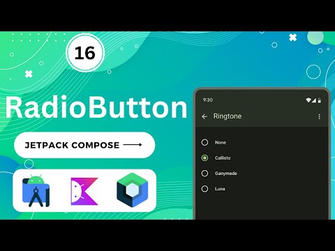
RadioButton:
RadioButtonis used to select a single option from a group of options. -
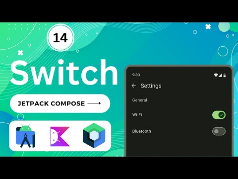
Switch:
Switchcreates an on/off switch. -
ProgressIndicator:
ProgressIndicatordisplays various types of progress indicators, such as circular or linear. -
Slider:
Sliderallows users to select a value from a range by sliding a thumb. -
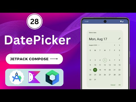
DatePicker:
DatePickerdisplays a date picker dialog. -
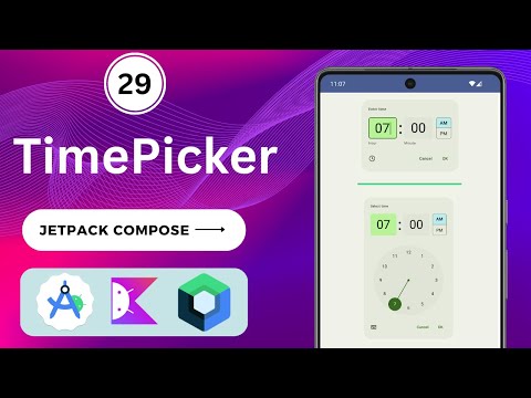
TimePicker:
TimePickerdisplays a time picker dialog. -
VideoView:
VideoViewis used for displaying videos in your app. -
WebView:
WebViewintegrates a web browser view into your app. -
Canvas:
Canvasprovides a drawing surface for creating custom graphics. -
Gesture Detection: Composables like
Modifier.clickableandModifier.swipeableenable gesture recognition. -
Animation: Jetpack Compose provides tools for creating animations, including
animate*modifiers. -
Accessibility: Composables support accessibility features with
Modifier.semanticsand related APIs.
Please keep in mind that Jetpack Compose is actively developed, and new features and components may have been added since my last knowledge update. It's essential to refer to the official Android documentation and release notes for the most up-to-date information on Jetpack Compose components and best practices.
Demo (click on Image for more details)
| Text | Row & Column | Box & Button |
|---|---|---|
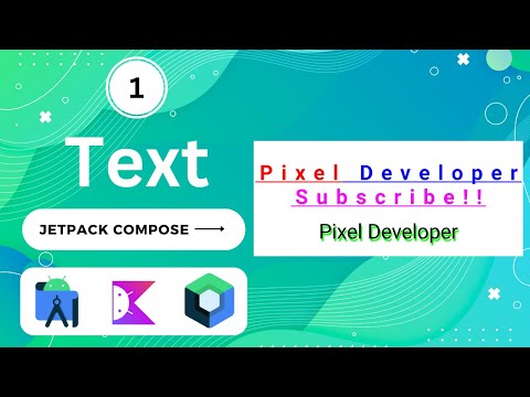 | 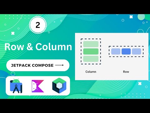 | 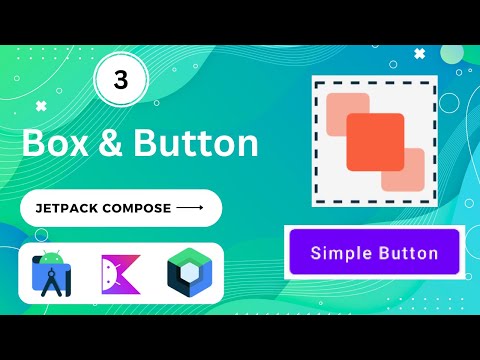 |
| Card & Image | LazyColumn & LazyRow | TextField (EditText) |
|---|---|---|
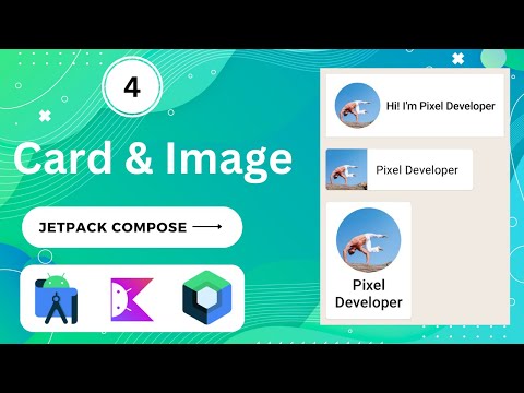 |  |  |
| Text Marquee | Splash Screen | AlertDialog |
|---|---|---|
 |  |  |
| Scaffold | TopAppBar | BottomAppBar |
|---|---|---|
 |  |  |
| FloatingActionButton | Snackbar | Switch |
|---|---|---|
 |  |  |
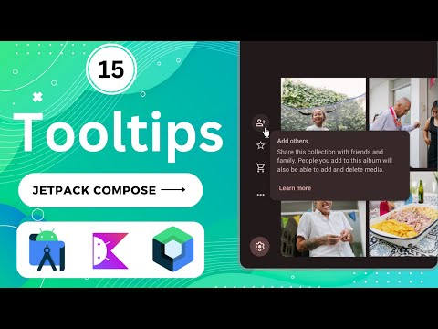
| ToolTips | ToolTip | CheckBox |
|---|---|---|
 |  |  |
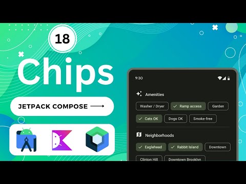
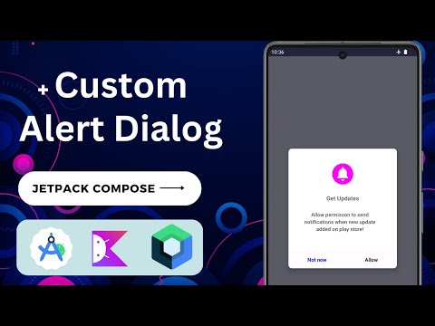
| Chips | Custom Alert | Spacers |
|---|---|---|
 |  |  |
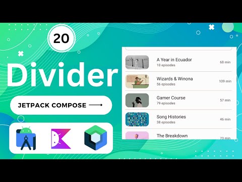
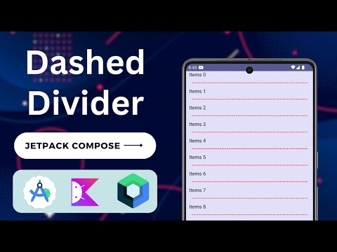
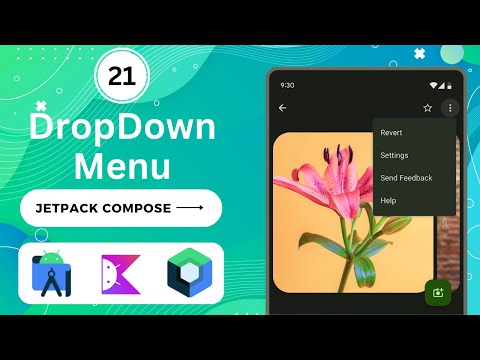
| Divider | Dashed Divider | DropDown Menu |
|---|---|---|
 |  |  |
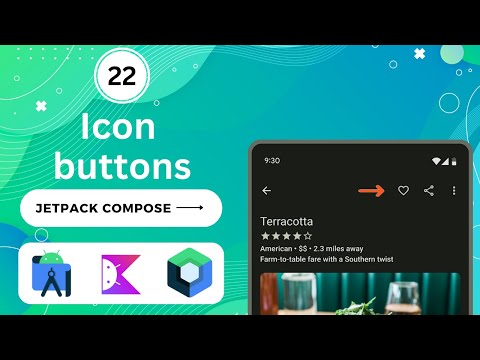
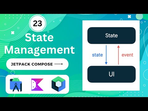
| IconButton | State Mangement | Navigation Drawer |
|---|---|---|
 |  |  |
| Custom Lists | Grid Lists | Bottom Sheets |
|---|---|---|
 |  |  |
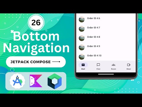
| Bottom Navigation Bar | Bottom Navigation Bar With Badge | Animated BottomNavigationBar |
|---|---|---|
 |  |  |
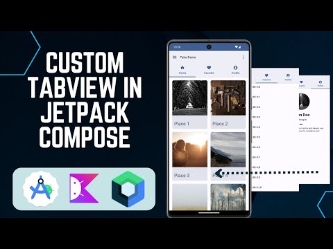
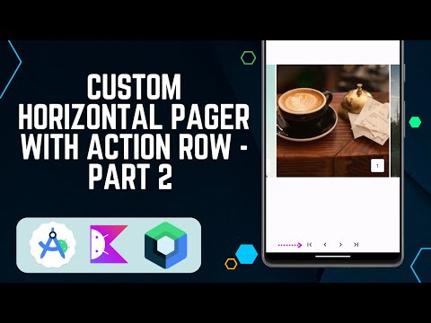
| Tabs Layout using TabRow | Tabs Layout With Pages | Custom Horizontal Pager |
|---|---|---|
 |  |  |
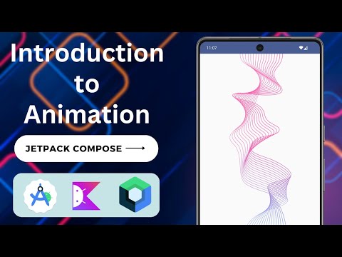
| Animation in Jetpack compose | DatePicker | TimePicker |
|---|---|---|
 |  |  |
Contributors
Showing top 1 contributor by commit count.

Related Repositories

bitwarden/android
Bitwarden mobile apps (Password Manager and Authenticator) for Android.

KunMinX/Jetpack-MVVM-Best-Practice
难得一见 Jetpack MVVM 最佳实践。在 "以简驭繁" 代码中,对 "视图控制器" 乃至 "标准化开发模式" 形成正确、深入理解。

skydoves/android-developer-roadmap
🗺 The Android Developer Roadmap offers comprehensive learning paths to help you understand Android ecosystems.

getActivity/AndroidProject
Android 技术中台,但愿人长久,搬砖不再有

Gurupreet/ComposeCookBook
A Collection on all Jetpack compose UI elements, Layouts, Widgets and Demo screens to see it's potential

igorwojda/android-showcase
💎 Android application following best practices: Kotlin, Coroutines, JetPack, Clean Architecture, Feature Modules, Tests, MVVM, DI, Static Analysis...