React native radio buttons group
Simple, best and easy to use radio buttons for react native apps.
Simple, best and easy to use radio buttons for react native apps. The project is written primarily in TypeScript, distributed under the MIT License license, first published in 2018. Key topics include: android, button, form, ios, radio.
React Native Radio Buttons Group
Simple, best and easy to use radio buttons for react native apps.


Getting Started
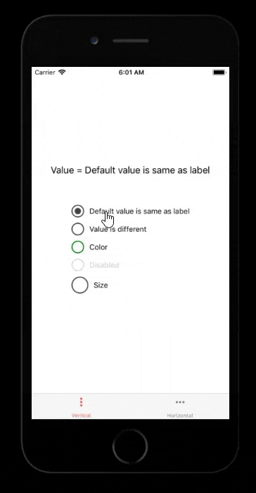
Just a sneak peek (lots more can be done)
Installation
bashnpm i react-native-radio-buttons-group --save
or
bashyarn add react-native-radio-buttons-group
Usage
JavaScript Example
App.js
jsximport React, { useMemo, useState } from 'react'; import RadioGroup from 'react-native-radio-buttons-group'; export default function App() { const radioButtons = useMemo(() => ([ { id: '1', // acts as primary key, should be unique and non-empty string label: 'Option 1', value: 'option1' }, { id: '2', label: 'Option 2', value: 'option2' } ]), []); const [selectedId, setSelectedId] = useState(); return ( <RadioGroup radioButtons={radioButtons} onPress={setSelectedId} selectedId={selectedId} /> ); }
TypeScript Example
App.tsx
tsximport React, { useMemo, useState } from 'react'; import RadioGroup, {RadioButtonProps} from 'react-native-radio-buttons-group'; export default function App() { const radioButtons: RadioButtonProps[] = useMemo(() => ([ { id: '1', // acts as primary key, should be unique and non-empty string label: 'Option 1', value: 'option1' }, { id: '2', label: 'Option 2', value: 'option2' } ]), []); const [selectedId, setSelectedId] = useState<string | undefined>(); return ( <RadioGroup radioButtons={radioButtons} onPress={setSelectedId} selectedId={selectedId} /> ); }
Props
RadioButton
| Key | Type | Required | Default | Valid Values |
|---|---|---|---|---|
| accessibilityLabel | string | no | Value of label | any string |
| borderColor | string | no | color | css color formats |
| borderSize | number | 2 | positive numbers | |
| color | string | no | #444 | css color formats |
| containerStyle | object | no | react style | |
| description | ReactNode or string | no | any react node or string | |
| descriptionStyle | object | no | react style, applied only if description is a string | |
| disabled | boolean | no | false | true / false |
| id | string | yes | unique string | |
| label | ReactNode or string | no | any react node or string | |
| labelStyle | object | no | react style, applied only if label is a string | |
| layout | enum | no | row | row / column |
| onPress | function | no | any function | |
| selected | boolean | no | false | true / false |
| size | number | no | 24 | positive numbers |
| testID | string | no | any string | |
| value | string | no | any string |
RadioGroup
| Key | Type | Required | Default | Valid Values |
|---|---|---|---|---|
| accessibilityLabel | string | no | any string | |
| containerStyle | object | no | react style | |
| labelStyle | object | no | react style | |
| layout | enum | no | column | row / column |
| onPress | function | no | any function | |
| radioButtons | array | yes | array of RadioButton objects | |
| selectedId | string | no | unique string | |
| testID | string | no | any string |
Horizontal (side by side)
jsx<RadioGroup radioButtons={radioButtons} onPress={onPressRadioButton} layout='row' />
Contributions
Fork and create a pull request
License
Stargazers over time

Sponsor
<a href="https://www.buymeacoffee.com/thakurballary" target="_blank"><img src="https://cdn.buymeacoffee.com/buttons/v2/default-yellow.png" alt="Buy Me A Coffee" style="height: 60px !important;width: 217px !important;" ></a>
Contributors
Showing top 12 contributors by commit count.


Related Repositories

flutter/flutter
Flutter makes it easy and fast to build beautiful apps for mobile and beyond

Genymobile/scrcpy
Display and control your Android device

react/react-native
A framework for building native applications using React

justjavac/free-programming-books-zh_CN
:books: 免费的计算机编程类中文书籍,欢迎投稿

rustdesk/rustdesk
An open-source remote desktop application designed for self-hosting, as an alternative to TeamViewer.

Hack-with-Github/Awesome-Hacking
A collection of various awesome lists for hackers, pentesters and security researchers