GradientLoadingBar
⌛️A customizable animated gradient loading bar.
A customizable animated gradient loading bar, with full support for **SwiftUI** and **UIKit**.\ Inspired by [iOS 7 Progress Bar on CodePen](https://codepen.io/marcobiedermann/pen/LExXWW). The project is written primarily in Swift, distributed under the MIT License license, first published in 2016. Key topics include: cocoapods, gradient, ios, loading-animations, loading-bar.
Gradient Loading Bar


A customizable animated gradient loading bar, with full support for SwiftUI and UIKit.
Inspired by iOS 7 Progress Bar on CodePen.
Screenshot
To run the example project, clone this repository and open the project file from the Example directory.
Requirements
- Swift 6.2
- Xcode 26
- iOS 26.0+
Compatibility Notes
- iOS < 26.0 / CocoaPods / Carthage support
Use version3.x.x - iOS < 13.0 support
Use version2.x.x
Installation
Swift Package Manager
Gradient Loading Bar is distributed via Swift Package Manager (SPM). Add it to your Xcode project as a package dependency or adapt your Package.swift file.
Option 1: Xcode
- Open your project in Xcode
- Go to File → Add Packages…
- Enter the package URL:
https://github.com/fxm90/GradientLoadingBar - Choose the version rule (e.g. Up to Next Major starting at 4.0.0)
- Add the package to your target
Option 2: Package.swift
If you manage dependencies manually, add this repository to the dependencies section of your Package.swift:
swiftdependencies: [ .package( url: "https://github.com/fxm90/GradientLoadingBar", from: "4.0.0" ) ]
Then reference the product in your target configuration:
swift.product( name: "GradientLoadingBar", package: "GradientLoadingBar" )
Once the package is added, import the framework where needed:
swiftimport GradientLoadingBar
Overview
This framework provides four types:
-
GradientLoadingBar
A controller class, managing the visibility of theGradientActivityIndicatorViewattached to the current key window. -
NotchGradientLoadingBar
A subclass ofGradientLoadingBar, wrapping theGradientActivityIndicatorViewaround the iPhone notch. -
GradientActivityIndicatorView
AUIViewcontaining the gradient with the animation. -
GradientLoadingBarView
A SwiftUIViewcontaining the gradient with the animation.
GradientLoadingBar
GradientLoadingBar is a controller-style object that manages a gradient loading bar attached to the app’s key window.
Usage
For most use cases, prefer the shared instance provided by GradientLoadingBar.shared.
swiftfinal class UserProfileViewController: UIViewController { override func viewDidLoad() { super.viewDidLoad() GradientLoadingBar.shared.fadeIn() userProfileService.fetchUserProfile { _ in // ... // Be sure to call this from the main actor! GradientLoadingBar.shared.fadeOut() } } }
This shared instance can be overridden to customize the loading bar globally.
Configuration
swiftlet gradientLoadingBar = GradientLoadingBar( height: 5.0, isRelativeToSafeArea: false, ) gradientLoadingBar.gradientColors = [.systemIndigo, .systemPurple, .systemPink] gradientLoadingBar.progressAnimationDuration = 4.5
Parameters
-
height: CGFloat
Sets the bar height (default:3.0) -
isRelativeToSafeArea: Bool
Determines whether the bar is positioned relative to the safe area (default:true)
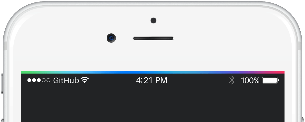
| Relative To Safe Area | Ignoring Safe Area |
|---|---|
 |  |
The gradient animation is easier to see in a video of the example application:
<details> <summary>🎬 Relative To Safe Area</summary>https://github.com/user-attachments/assets/c8a3a117-c164-49f5-9511-aa29b92b5344
</details> <details> <summary>🎬 Ignoring Safe Area</summary>https://github.com/user-attachments/assets/4abad13d-e019-43b3-b3b3-c874ac8f9224
</details>Note: For a third option — wrapping around the iPhone notch — see NotchGradientLoadingBar.
Properties
-
gradientColors: [UIColor]
Defines the gradient colors. -
progressAnimationDuration: TimeInterval
Controls how fast the gradient animates from left to right.
Methods
-
fadeIn(duration: TimeInterval = 0.33, completion: ((Bool) -> Void)? = nil)
Fades the loading bar in. -
fadeOut(duration: TimeInterval = 0.66, completion: ((Bool) -> Void)? = nil)
Fades the loading bar out.
NotchGradientLoadingBar
NotchGradientLoadingBar is a subclass of GradientLoadingBar that wraps the bar around the iPhone notch.
On devices without a notch, it behaves identically to GradientLoadingBar.
| iPhone 12 Pro | iPhone 13 Pro Max |
|---|---|
 |  |
The gradient animation is easier to see in a video of the example application:
<details> <summary>🎬 iPhone 12 Pro</summary>https://github.com/user-attachments/assets/998fe36c-40c5-4c70-9ce8-e7a7f3f126d8
</details> <details> <summary>🎬 iPhone 13 Pro Max</summary>https://github.com/user-attachments/assets/2ff6d717-07f1-4d70-887e-2727d55f2515
</details>GradientActivityIndicatorView
If you prefer direct view composition, GradientActivityIndicatorView is a UIView subclass that can be added to other views — such as UINavigationBar, UIButton or a custom container.
Usage
Store an instance as a property, set up constraints and control the visibility using fadeIn() and fadeOut().
swiftfinal class UserProfileViewController: UIViewController { private let gradientActivityIndicatorView = GradientActivityIndicatorView() // ... override func viewDidLoad() { super.viewDidLoad() gradientActivityIndicatorView.translatesAutoresizingMaskIntoConstraints = false view.addSubview(gradientActivityIndicatorView) NSLayoutConstraint.activate([ gradientActivityIndicatorView.leadingAnchor.constraint(equalTo: view.leadingAnchor), gradientActivityIndicatorView.trailingAnchor.constraint(equalTo: view.trailingAnchor), gradientActivityIndicatorView.topAnchor.constraint(equalTo: view.topAnchor), gradientActivityIndicatorView.heightAnchor.constraint(equalToConstant: 3), ]) gradientActivityIndicatorView.fadeIn() userProfileService.fetchUserProfile { [weak self] _ in // ... // Be sure to call this from the main actor! self?.gradientActivityIndicatorView.fadeOut() } } }
Configuration
swiftlet gradientActivityIndicatorView = GradientActivityIndicatorView() gradientActivityIndicatorView.gradientColors = [.systemIndigo, .systemPurple, .systemPink] gradientActivityIndicatorView.progressAnimationDuration = 4.5
Properties
-
isHidden: Bool
Toggles the view visibility and starts / stops the progress animation accordingly. -
gradientColors: [UIColor]
Defines the gradient colors. -
progressAnimationDuration: TimeInterval
Controls how fast the gradient animates from left to right.
Methods
-
fadeIn(duration: TimeInterval = 0.33, completion: ((Bool) -> Void)? = nil)
Fades the view in. -
fadeOut(duration: TimeInterval = 0.66, completion: ((Bool) -> Void)? = nil)
Fades the view out. -
animate(isHidden: Bool, duration: TimeInterval, completion: ((Bool) -> Void)? = nil)
Fades the view in- or out, based on the provided hidden flag.
GradientLoadingBarView
GradientLoadingBarView is the SwiftUI equivalent of GradientActivityIndicatorView.
Usage
swiftstruct ContentView: View { var body: some View { GradientLoadingBarView() .frame(maxWidth: .infinity, maxHeight: 3) .cornerRadius(1.5) } }
Configuration
swiftGradientLoadingBarView( gradientColors: [.indigo, .purple, .pink], progressDuration: 4.5, )
Parameters
-
gradientColors: [Color]
Defines the gradient colors. -
progressDuration: TimeInterval
Sets the animation speed.
Visibility & Animation
Control the visibility using standard SwiftUI view modifiers such as:
Example with fade animation.
swiftstruct ContentView: View { @State private var isVisible = false var body: some View { VStack { GradientLoadingBarView() .frame(maxWidth: .infinity, maxHeight: 3) .cornerRadius(1.5) .opacity(isVisible ? 1 : 0) .animation(.easeInOut, value: isVisible) Button("Toggle visibility") { isVisible.toggle() } } } }
Author
Felix Mau
me(@)felix.hamburg
License
Gradient Loading Bar is released under the MIT License. See the LICENSE file for details.
Contributors
Showing top 6 contributors by commit count.


Related Repositories

dkhamsing/open-source-ios-apps
:iphone: Collaborative List of Open-Source iOS Apps

Alamofire/Alamofire
Elegant HTTP Networking in Swift

SDWebImage/SDWebImage
Asynchronous image downloader with cache support as a UIImageView category

SwiftyJSON/SwiftyJSON
The better way to deal with JSON data in Swift.

SnapKit/SnapKit
A Swift Autolayout DSL for iOS & OS X

SwifterSwift/SwifterSwift
A handy collection of more than 500 native Swift extensions to boost your productivity.