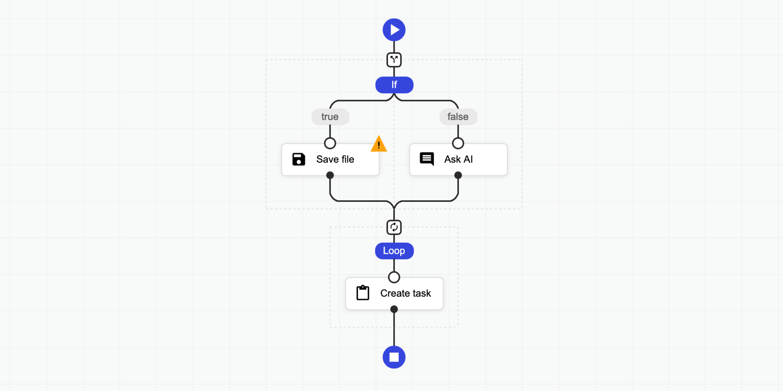
Sequential workflow designer
Customizable no-code component for building flow-based programming applications or workflow automation. 0 external dependencies. Check out https://nocode-js.com
Sequential workflow designer with no external dependencies for web applications. It is written in pure TypeScript and uses SVG for rendering. This designer is not associated with any workflow engine, it is fully generic. You can use it to create any kind of application, from graphical programming languages to workflow builders. The project is written primarily in TypeScript, distributed under the MIT License license, first published in 2022. It has gained significant community traction with 1,440 stars and 148 forks on GitHub. Key topics include: agent-builder, agentflow, ai-designer, automation, component.
Sequential Workflow Designer

Sequential workflow designer with no external dependencies for web applications. It is written in pure TypeScript and uses SVG for rendering. This designer is not associated with any workflow engine, it is fully generic. You can use it to create any kind of application, from graphical programming languages to workflow builders.
Features:
- No external dependencies
- Fully generic and configurable
- Supports light, dark, and soft themes, with easy customization
- Compatible with modern browsers and mobile devices
- Definitions are stored as JSON
- Supports Angular, React and Svelte.
📝 Check the documentation for more details.
🤩 Don't miss the pro version.
👀 Examples
- ⏩ Live Testing
- 💥 Triggers
- ❎ Fullscreen
- 🌅 Image Filter
- 🔴 Particles
- 🌍 Internationalization
- ⛅ Light Dark
- 🤖 Code Generator
- 🌻 Rendering Test
- 🚄 Stress Test
- 🚪 Editing Restrictions
- 📜 Scrollable Page
- 🌵 Multi-Conditional Switch
- 🌀 Auto-Select
- 🔄 Step Changes Detection
- Angular Demo
- React Demo
- Svelte Demo
Pro:
- 🤩 Pro Components
- 🍬 Custom Theme Flat
- 🌹 Custom Step Types
- 📺 Popup Editor
- 🔽 Collapsible Region
- 💼 Copy Paste
- 👈 Goto
- 📁 Folders
- ⭕ Wheel Mode
- 💠 Grid
- 🐭 Minimal Root Component
- 🦁 External UI Components
- 👋 Custom Dragged Component
- 🔰 Badges
- 🎩 Custom Viewport
- 👊 Double Click
- 🛎 Clickable Placeholder
- 📮 Conditional Placeholders
- React Pro Demo
- Angular Pro Demo
👩💻 Integrations
- ⛽ Sequential Workflow Editor - Powerful step editor builder. Don't write step editors manually, build them.
- 🚚 Sequential Workflow Machine - Workflow engine for browser and NodeJS apps, powered by the xstate library.
🚀 Installation
To use the designer you should add JS/TS files and CSS files to your project.
NPM
Install this package by NPM command:
npm i sequential-workflow-designer
To import the package:
tsimport { Designer } from 'sequential-workflow-designer';
If you use css-loader or similar, you can add CSS files to your bundle:
tsimport 'sequential-workflow-designer/css/designer.css'; import 'sequential-workflow-designer/css/designer-light.css'; import 'sequential-workflow-designer/css/designer-soft.css'; import 'sequential-workflow-designer/css/designer-dark.css';
To create the designer write the below code:
ts// ... Designer.create(placeholder, definition, configuration);
CDN
Add the below code to your head section in HTML document.
html<head> ... <link href="https://cdn.jsdelivr.net/npm/sequential-workflow-designer@0.38.1/css/designer.css" rel="stylesheet" /> <link href="https://cdn.jsdelivr.net/npm/sequential-workflow-designer@0.38.1/css/designer-light.css" rel="stylesheet" /> <link href="https://cdn.jsdelivr.net/npm/sequential-workflow-designer@0.38.1/css/designer-dark.css" rel="stylesheet" /> <script src="https://cdn.jsdelivr.net/npm/sequential-workflow-designer@0.38.1/dist/index.umd.js"></script> </head>
Call the designer by:
jssequentialWorkflowDesigner.Designer.create(placeholder, definition, configuration);
🎬 Usage
Check examples directory.
tsimport { Designer } from 'sequential-workflow-designer'; const placeholder = document.getElementById('placeholder'); const definition = { properties: { myProperty: 'my-value', // root properties... }, sequence: [ // steps... ], }; const configuration = { theme: 'light', // optional, default: 'light' isReadonly: false, // optional, default: false undoStackSize: 10, // optional, default: 0 - disabled, 1+ - enabled steps: { // all properties in this section are optional iconUrlProvider: (componentType, type) => { return `icon-${componentType}-${type}.svg`; }, isDraggable: (step, parentSequence) => { return step.name !== 'y'; }, isDeletable: (step, parentSequence) => { return step.properties['isDeletable']; }, isDuplicable: (step, parentSequence) => { return true; }, canInsertStep: (step, targetSequence, targetIndex) => { return targetSequence.length < 5; }, canMoveStep: (sourceSequence, step, targetSequence, targetIndex) => { return !step.properties['isLocked']; }, canDeleteStep: (step, parentSequence) => { return step.name !== 'x'; }, }, validator: { // all validators are optional step: (step, parentSequence, definition) => { return /^[a-z]+$/.test(step.name); }, root: definition => { return definition.properties['memory'] > 256; }, }, toolbox: { isCollapsed: false, groups: [ { name: 'Files', steps: [ // steps for the toolbox's group ], }, { name: 'Notification', steps: [ // steps for the toolbox's group ], }, ], }, editors: { isCollapsed: false, rootEditorProvider: (definition, rootContext, isReadonly) => { const editor = document.createElement('div'); // ... return editor; }, stepEditorProvider: (step, stepContext, definition, isReadonly) => { const editor = document.createElement('div'); // ... return editor; }, }, controlBar: true, contextMenu: true, }; const designer = Designer.create(placeholder, definition, configuration); designer.onDefinitionChanged.subscribe(event => { // ... });
You can hide default UI components by setting the corresponding configuration property to false.
tsconst configuration = { toolbox: false, editors: false, controlBar: false, contextMenu: false, // ... };
💡 License
This project is released under the MIT license.
Contributors
Showing top 1 contributor by commit count.

Related Repositories

arc53/DocsGPT
Private AI platform for agents, assistants and enterprise search. Built-in Agent Builder, Deep research, Document analysis, Multi-model support, and API connectivity for agents.

inkeep/agents
Create AI Agents in a No-Code Visual Builder or TypeScript SDK with full 2-way sync. For shipping AI assistants and multi-agent AI workflows.

LiteLLM-Labs/litellm-agent-control-plane
1 place to call all your agents - OpenCode, Hermes, Claude Managed Agents, Cursor Agents API, DeepAgents.

giselles-ai/giselle
Giselle: AI App Builder. Open Source.

vibesurf-ai/VibeSurf
A powerful browser assistant for vibe surfing 一个开源的AI浏览器智能助手

Josephrp/DataTonic
🌟DataTonic : A Data-Capable AGI-style Agent Builder of Agents , that creates swarms , runs commands and securely processes and creates datasets, databases, visualisations, and analyses.