Primereact
The Most Complete React UI Component Library
PrimeReact is a rich set of open source UI Components for React. See [PrimeReact homepage](https://primereact.org/) for live showcase and documentation. The project is written primarily in CSS, distributed under the MIT License license, first published in 2016. It has gained significant community traction with 8,308 stars and 1,208 forks on GitHub. Key topics include: bootstrap, bootstrap-table, charts, datatable, flex.







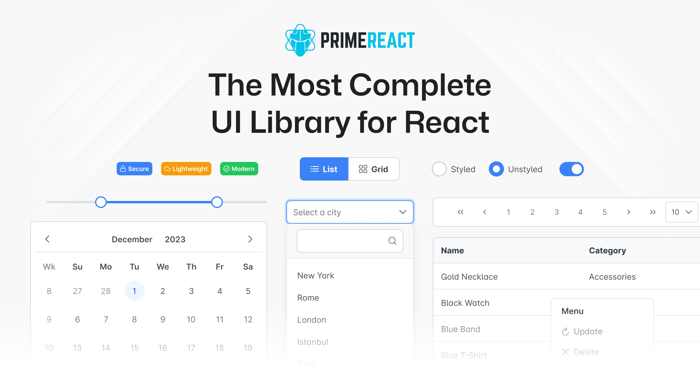
PrimeReact
PrimeReact is a rich set of open source UI Components for React. See PrimeReact homepage for live showcase and documentation.
Download
PrimeReact is available at npm.
# Using npm
npm install primereact

# Using yarn
yarn add primereact

# Using pnpm
pnpm add primereact
Import
Each component can be imported individually so that you only bundle what you use. Import path is available in the documentation of the corresponding component.
javascript//import { ComponentName } from 'primereact/{componentname}'; import { Button } from 'primereact/button'; export default function MyComponent() { return ( <Button label="PrimeReact" /> ) }
Theming
PrimeReact has two theming modes; styled or unstyled.
Styled Mode
Styled mode is based on pre-skinned components with opinionated themes like Material, Bootstrap or PrimeOne themes. Theme is the required css file to be imported, visit the Themes section for the complete list of available themes to choose from.
javascript// theme import 'primereact/resources/themes/lara-light-cyan/theme.css';
Unstyled Mode
Unstyled mode is disabled by default for all components. Using the PrimeReact context, set unstyled as true to enable it globally. Visit the Unstyled mode documentation for more information and examples.
Contributors
<a href="https://github.com/primefaces/primereact/graphs/contributors"> <img src="https://contrib.rocks/image?repo=primefaces/primereact" /> </a>Contributors
Showing top 12 contributors by commit count.


![dependabot[bot]](https://avatars.githubusercontent.com/in/29110?v=4)

